 Data Science
Chapter 5 Classification I: training & predicting
5.1 Overview
In previous chapters, we focused solely on descriptive and exploratory data analysis questions. This chapter and the next together serve as our first foray into answering predictive questions about data. In particular, we will focus on classification, i.e., using one or more variables to predict the value of a categorical variable of interest. This chapter will cover the basics of classification, how to preprocess data to make it suitable for use in a classifier, and how to use our observed data to make predictions. The next chapter will focus on how to evaluate how accurate the predictions from our classifier are, as well as how to improve our classifier (where possible) to maximize its accuracy.
5.2 Chapter learning objectives
By the end of the chapter, readers will be able to do the following:
- Recognize situations where a classifier would be appropriate for making predictions.
- Describe what a training data set is and how it is used in classification.
- Interpret the output of a classifier.
- Compute, by hand, the straight-line (Euclidean) distance between points on a graph when there are two predictor variables.
- Explain the K-nearest neighbors classification algorithm.
- Perform K-nearest neighbors classification in R using
tidymodels. - Use a
recipeto center, scale, balance, and impute data as a preprocessing step. - Combine preprocessing and model training using a
workflow.
5.3 The classification problem
In many situations, we want to make predictions based on the current situation as well as past experiences. For instance, a doctor may want to diagnose a patient as either diseased or healthy based on their symptoms and the doctor’s past experience with patients; an email provider might want to tag a given email as “spam” or “not spam” based on the email’s text and past email text data; or a credit card company may want to predict whether a purchase is fraudulent based on the current purchase item, amount, and location as well as past purchases. These tasks are all examples of classification, i.e., predicting a categorical class (sometimes called a label) for an observation given its other variables (sometimes called features).
Generally, a classifier assigns an observation without a known class (e.g., a new patient) to a class (e.g., diseased or healthy) on the basis of how similar it is to other observations for which we do know the class (e.g., previous patients with known diseases and symptoms). These observations with known classes that we use as a basis for prediction are called a training set; this name comes from the fact that we use these data to train, or teach, our classifier. Once taught, we can use the classifier to make predictions on new data for which we do not know the class.
There are many possible methods that we could use to predict a categorical class/label for an observation. In this book, we will focus on the widely used K-nearest neighbors algorithm (Fix and Hodges 1951; Cover and Hart 1967). In your future studies, you might encounter decision trees, support vector machines (SVMs), logistic regression, neural networks, and more; see the additional resources section at the end of the next chapter for where to begin learning more about these other methods. It is also worth mentioning that there are many variations on the basic classification problem. For example, we focus on the setting of binary classification where only two classes are involved (e.g., a diagnosis of either healthy or diseased), but you may also run into multiclass classification problems with more than two categories (e.g., a diagnosis of healthy, bronchitis, pneumonia, or a common cold).
5.4 Exploring a data set
In this chapter and the next, we will study a data set of digitized breast cancer image features, created by Dr. William H. Wolberg, W. Nick Street, and Olvi L. Mangasarian (Street, Wolberg, and Mangasarian 1993). Each row in the data set represents an image of a tumor sample, including the diagnosis (benign or malignant) and several other measurements (nucleus texture, perimeter, area, and more). Diagnosis for each image was conducted by physicians.
As with all data analyses, we first need to formulate a precise question that we want to answer. Here, the question is predictive: can we use the tumor image measurements available to us to predict whether a future tumor image (with unknown diagnosis) shows a benign or malignant tumor? Answering this question is important because traditional, non-data-driven methods for tumor diagnosis are quite subjective and dependent upon how skilled and experienced the diagnosing physician is. Furthermore, benign tumors are not normally dangerous; the cells stay in the same place, and the tumor stops growing before it gets very large. By contrast, in malignant tumors, the cells invade the surrounding tissue and spread into nearby organs, where they can cause serious damage (Stanford Health Care 2021). Thus, it is important to quickly and accurately diagnose the tumor type to guide patient treatment.
5.4.1 Loading the cancer data
Our first step is to load, wrangle, and explore the data using visualizations
in order to better understand the data we are working with. We start by
loading the tidyverse package needed for our analysis.
In this case, the file containing the breast cancer data set is a .csv
file with headers. We’ll use the read_csv function with no additional
arguments, and then inspect its contents:
## # A tibble: 569 × 12
##        ID Class Radius Texture Perimeter   Area Smoothness Compactness Concavity
##     <dbl> <chr>  <dbl>   <dbl>     <dbl>  <dbl>      <dbl>       <dbl>     <dbl>
##  1 8.42e5 M      1.10   -2.07     1.27    0.984      1.57       3.28      2.65
##  2 8.43e5 M      1.83   -0.353    1.68    1.91      -0.826     -0.487    -0.0238
##  3 8.43e7 M      1.58    0.456    1.57    1.56       0.941      1.05      1.36
##  4 8.43e7 M     -0.768   0.254   -0.592  -0.764      3.28       3.40      1.91
##  5 8.44e7 M      1.75   -1.15     1.78    1.82       0.280      0.539     1.37
##  6 8.44e5 M     -0.476  -0.835   -0.387  -0.505      2.24       1.24      0.866
##  7 8.44e5 M      1.17    0.161    1.14    1.09      -0.123      0.0882    0.300
##  8 8.45e7 M     -0.118   0.358   -0.0728 -0.219      1.60       1.14      0.0610
##  9 8.45e5 M     -0.320   0.588   -0.184  -0.384      2.20       1.68      1.22
## 10 8.45e7 M     -0.473   1.10    -0.329  -0.509      1.58       2.56      1.74
## # ℹ 559 more rows
## # ℹ 3 more variables: Concave_Points <dbl>, Symmetry <dbl>,
## #   Fractal_Dimension <dbl>
5.4.2 Describing the variables in the cancer data set
Breast tumors can be diagnosed by performing a biopsy, a process where tissue is removed from the body and examined for the presence of disease. Traditionally these procedures were quite invasive; modern methods such as fine needle aspiration, used to collect the present data set, extract only a small amount of tissue and are less invasive. Based on a digital image of each breast tissue sample collected for this data set, ten different variables were measured for each cell nucleus in the image (items 3–12 of the list of variables below), and then the mean for each variable across the nuclei was recorded. As part of the data preparation, these values have been standardized (centered and scaled); we will discuss what this means and why we do it later in this chapter. Each image additionally was given a unique ID and a diagnosis by a physician. Therefore, the total set of variables per image in this data set is:
- ID: identification number
- Class: the diagnosis (M = malignant or B = benign)
- Radius: the mean of distances from center to points on the perimeter
- Texture: the standard deviation of gray-scale values
- Perimeter: the length of the surrounding contour
- Area: the area inside the contour
- Smoothness: the local variation in radius lengths
- Compactness: the ratio of squared perimeter and area
- Concavity: severity of concave portions of the contour
- Concave Points: the number of concave portions of the contour
- Symmetry: how similar the nucleus is when mirrored
- Fractal Dimension: a measurement of how “rough” the perimeter is
Below we use glimpse to preview the data frame. This function can
make it easier to inspect the data when we have a lot of columns,
as it prints the data such that the columns go down
the page (instead of across).
## Rows: 569
## Columns: 12
## $ ID                <dbl> 842302, 842517, 84300903, 84348301, 84358402, 843786…
## $ Class             <chr> "M", "M", "M", "M", "M", "M", "M", "M", "M", "M", "M…
## $ Radius            <dbl> 1.0960995, 1.8282120, 1.5784992, -0.7682333, 1.74875…
## $ Texture           <dbl> -2.0715123, -0.3533215, 0.4557859, 0.2535091, -1.150…
## $ Perimeter         <dbl> 1.26881726, 1.68447255, 1.56512598, -0.59216612, 1.7…
## $ Area              <dbl> 0.98350952, 1.90703027, 1.55751319, -0.76379174, 1.8…
## $ Smoothness        <dbl> 1.56708746, -0.82623545, 0.94138212, 3.28066684, 0.2…
## $ Compactness       <dbl> 3.28062806, -0.48664348, 1.05199990, 3.39991742, 0.5…
## $ Concavity         <dbl> 2.65054179, -0.02382489, 1.36227979, 1.91421287, 1.3…
## $ Concave_Points    <dbl> 2.53024886, 0.54766227, 2.03543978, 1.45043113, 1.42…
## $ Symmetry          <dbl> 2.215565542, 0.001391139, 0.938858720, 2.864862154, …
## $ Fractal_Dimension <dbl> 2.25376381, -0.86788881, -0.39765801, 4.90660199, -0…
From the summary of the data above, we can see that Class is of type character
(denoted by <chr>). We can use the distinct function to see all the unique
values present in that column. We see that there are two diagnoses: benign, represented by “B”,
and malignant, represented by “M”.
## # A tibble: 2 × 1
##   Class
##   <chr>
## 1 M
## 2 B
Since we will be working with Class as a categorical
variable, it is a good idea to convert it to a factor type using the as_factor function.
We will also improve the readability of our analysis by renaming “M” to
“Malignant” and “B” to “Benign” using the fct_recode method. The fct_recode method
is used to replace the names of factor values with other names. The arguments of fct_recode are the column that you
want to modify, followed any number of arguments of the form "new name" = "old name" to specify the renaming scheme.
cancer <- cancer |>
  mutate(Class = as_factor(Class)) |>
  mutate(Class = fct_recode(Class, "Malignant" = "M", "Benign" = "B"))
glimpse(cancer)
## Rows: 569
## Columns: 12
## $ ID <dbl> 842302, 842517, 84300903, 84348301, 84358402, 843786…
## $ Class <fct> Malignant, Malignant, Malignant, Malignant, Malignan…
## $ Radius <dbl> 1.0960995, 1.8282120, 1.5784992, -0.7682333, 1.74875…
## $ Texture <dbl> -2.0715123, -0.3533215, 0.4557859, 0.2535091, -1.150…
## $ Perimeter <dbl> 1.26881726, 1.68447255, 1.56512598, -0.59216612, 1.7…
## $ Area <dbl> 0.98350952, 1.90703027, 1.55751319, -0.76379174, 1.8…
## $ Smoothness <dbl> 1.56708746, -0.82623545, 0.94138212, 3.28066684, 0.2…
## $ Compactness <dbl> 3.28062806, -0.48664348, 1.05199990, 3.39991742, 0.5…
## $ Concavity <dbl> 2.65054179, -0.02382489, 1.36227979, 1.91421287, 1.3…
## $ Concave_Points <dbl> 2.53024886, 0.54766227, 2.03543978, 1.45043113, 1.42…
## $ Symmetry <dbl> 2.215565542, 0.001391139, 0.938858720, 2.864862154, …
## $ Fractal_Dimension <dbl> 2.25376381, -0.86788881, -0.39765801, 4.90660199, -0…Let’s verify that we have successfully converted the Class column to a factor variable
and renamed its values to “Benign” and “Malignant” using the distinct function once more.
## # A tibble: 2 × 1
##   Class
##   <fct>
## 1 Malignant
## 2 Benign
5.4.3 Exploring the cancer data
Before we start doing any modeling, let’s explore our data set. Below we use
the group_by, summarize and n functions to find the number and percentage
of benign and malignant tumor observations in our data set. The n function within
summarize, when paired with group_by, counts the number of observations in each Class group.
Then we calculate the percentage in each group by dividing by the total number of observations
and multiplying by 100. We have 357 (63%) benign and 212 (37%) malignant tumor observations.
num_obs <- nrow(cancer)
cancer |>
  group_by(Class) |>
  summarize(
    count = n(),
    percentage = n() / num_obs * 100
  )
## # A tibble: 2 × 3
## Class count percentage
## <fct> <int> <dbl>
## 1 Malignant 212 37.3
## 2 Benign 357 62.7Next, let’s draw a scatter plot to visualize the relationship between the
perimeter and concavity variables. Rather than use ggplot's default palette,
we select our own colorblind-friendly colors—"darkorange"
for orange and "steelblue" for blue—and
pass them as the values argument to the scale_color_manual function.
perim_concav <- cancer |>
  ggplot(aes(x = Perimeter, y = Concavity, color = Class)) +
  geom_point(alpha = 0.6) +
  labs(x = "Perimeter (standardized)",
       y = "Concavity (standardized)",
       color = "Diagnosis") +
  scale_color_manual(values = c("darkorange", "steelblue")) +
  theme(text = element_text(size = 12))
perim_concav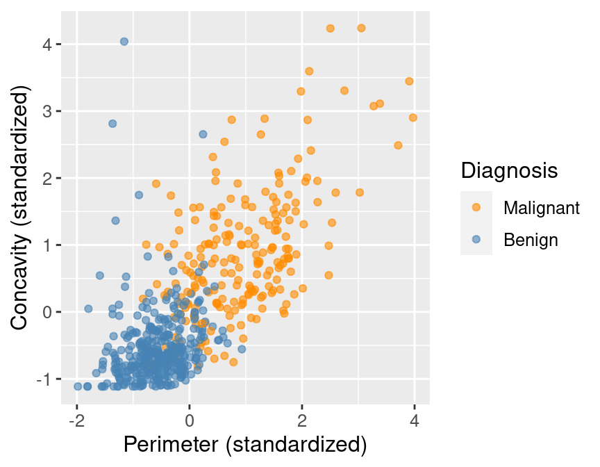
Figure 5.1: Scatter plot of concavity versus perimeter colored by diagnosis label.
In Figure 5.1, we can see that malignant observations typically fall in
the upper right-hand corner of the plot area. By contrast, benign
observations typically fall in the lower left-hand corner of the plot. In other words,
benign observations tend to have lower concavity and perimeter values, and malignant
ones tend to have larger values. Suppose we
obtain a new observation not in the current data set that has all the variables
measured except the label (i.e., an image without the physician’s diagnosis
for the tumor class). We could compute the standardized perimeter and concavity values,
resulting in values of, say, 1 and 1. Could we use this information to classify
that observation as benign or malignant? Based on the scatter plot, how might
you classify that new observation? If the standardized concavity and perimeter
values are 1 and 1 respectively, the point would lie in the middle of the
orange cloud of malignant points and thus we could probably classify it as
malignant. Based on our visualization, it seems like it may be possible
to make accurate predictions of the Class variable (i.e., a diagnosis) for
tumor images with unknown diagnoses.
5.5 Classification with K-nearest neighbors
In order to actually make predictions for new observations in practice, we will need a classification algorithm. In this book, we will use the K-nearest neighbors classification algorithm. To predict the label of a new observation (here, classify it as either benign or malignant), the K-nearest neighbors classifier generally finds the \(K\) “nearest” or “most similar” observations in our training set, and then uses their diagnoses to make a prediction for the new observation’s diagnosis. \(K\) is a number that we must choose in advance; for now, we will assume that someone has chosen \(K\) for us. We will cover how to choose \(K\) ourselves in the next chapter.
To illustrate the concept of K-nearest neighbors classification, we will walk through an example. Suppose we have a new observation, with standardized perimeter of 2 and standardized concavity of 4, whose diagnosis “Class” is unknown. This new observation is depicted by the red, diamond point in Figure 5.2.

Figure 5.2: Scatter plot of concavity versus perimeter with new observation represented as a red diamond.
Figure 5.3 shows that the nearest point to this new observation is malignant and located at the coordinates (2.1, 3.6). The idea here is that if a point is close to another in the scatter plot, then the perimeter and concavity values are similar, and so we may expect that they would have the same diagnosis.

Figure 5.3: Scatter plot of concavity versus perimeter. The new observation is represented as a red diamond with a line to the one nearest neighbor, which has a malignant label.
Suppose we have another new observation with standardized perimeter 0.2 and concavity of 3.3. Looking at the scatter plot in Figure 5.4, how would you classify this red, diamond observation? The nearest neighbor to this new point is a benign observation at (0.2, 2.7). Does this seem like the right prediction to make for this observation? Probably not, if you consider the other nearby points.
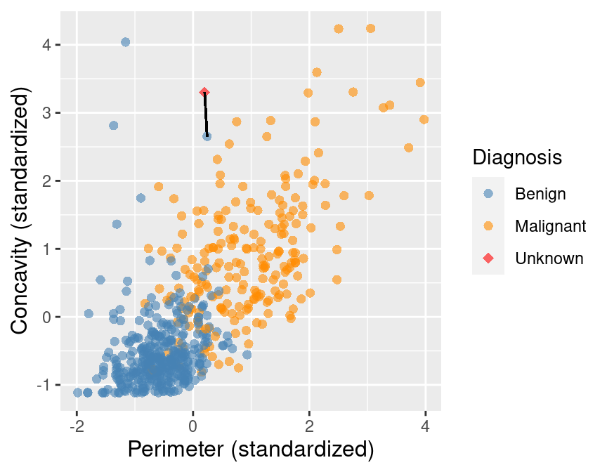
Figure 5.4: Scatter plot of concavity versus perimeter. The new observation is represented as a red diamond with a line to the one nearest neighbor, which has a benign label.
To improve the prediction we can consider several neighboring points, say \(K = 3\), that are closest to the new observation to predict its diagnosis class. Among those 3 closest points, we use the majority class as our prediction for the new observation. As shown in Figure 5.5, we see that the diagnoses of 2 of the 3 nearest neighbors to our new observation are malignant. Therefore we take majority vote and classify our new red, diamond observation as malignant.
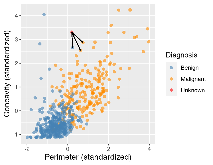
Figure 5.5: Scatter plot of concavity versus perimeter with three nearest neighbors.
Here we chose the \(K=3\) nearest observations, but there is nothing special about \(K=3\). We could have used \(K=4, 5\) or more (though we may want to choose an odd number to avoid ties). We will discuss more about choosing \(K\) in the next chapter.
5.5.1 Distance between points
We decide which points are the \(K\) “nearest” to our new observation using the straight-line distance (we will often just refer to this as distance). Suppose we have two observations \(a\) and \(b\), each having two predictor variables, \(x\) and \(y\). Denote \(a_x\) and \(a_y\) to be the values of variables \(x\) and \(y\) for observation \(a\); \(b_x\) and \(b_y\) have similar definitions for observation \(b\). Then the straight-line distance between observation \(a\) and \(b\) on the x-y plane can be computed using the following formula:
\[\mathrm{Distance} = \sqrt{(a_x -b_x)^2 + (a_y - b_y)^2}\]
To find the \(K\) nearest neighbors to our new observation, we compute the distance
from that new observation to each observation in our training data, and select the \(K\) observations corresponding to the
\(K\) smallest distance values. For example, suppose we want to use \(K=5\) neighbors to classify a new
observation with perimeter of 0 and
concavity of 3.5, shown as a red diamond in Figure 5.6. Let’s calculate the distances
between our new point and each of the observations in the training set to find
the \(K=5\) neighbors that are nearest to our new point.
You will see in the mutate step below, we compute the straight-line
distance using the formula above: we square the differences between the two observations’ perimeter
and concavity coordinates, add the squared differences, and then take the square root.
In order to find the \(K=5\) nearest neighbors, we will use the slice_min function.
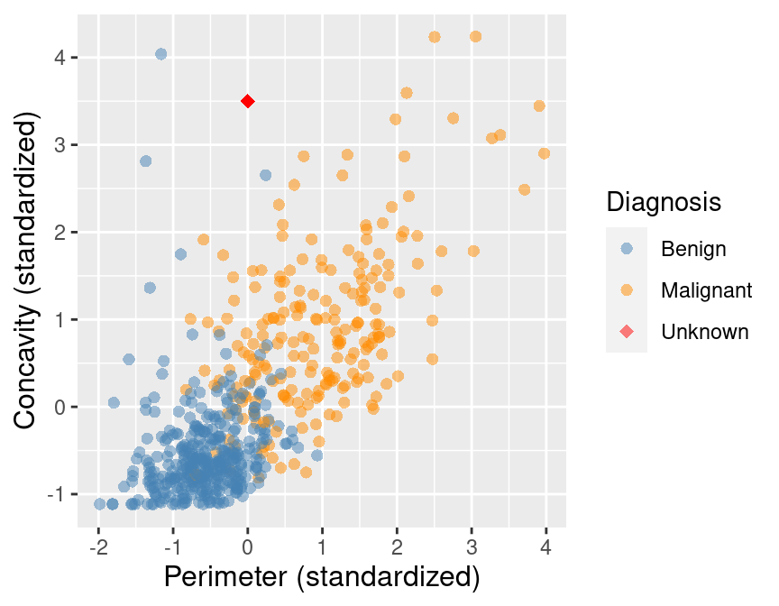
Figure 5.6: Scatter plot of concavity versus perimeter with new observation represented as a red diamond.
new_obs_Perimeter <- 0
new_obs_Concavity <- 3.5
cancer |>
  select(ID, Perimeter, Concavity, Class) |>
  mutate(dist_from_new = sqrt((Perimeter - new_obs_Perimeter)^2 +
                              (Concavity - new_obs_Concavity)^2)) |>
  slice_min(dist_from_new, n = 5) # take the 5 rows of minimum distance
## # A tibble: 5 × 5
## ID Perimeter Concavity Class dist_from_new
## <dbl> <dbl> <dbl> <fct> <dbl>
## 1 86409 0.241 2.65 Benign 0.881
## 2 887181 0.750 2.87 Malignant 0.980
## 3 899667 0.623 2.54 Malignant 1.14
## 4 907914 0.417 2.31 Malignant 1.26
## 5 8710441 -1.16 4.04 Benign 1.28In Table 5.1 we show in mathematical detail how
the mutate step was used to compute the dist_from_new variable (the
distance to the new observation) for each of the 5 nearest neighbors in the
training data.
| Perimeter | Concavity | Distance | Class |
|---|---|---|---|
| 0.24 | 2.65 | \(\sqrt{(0 - 0.24)^2 + (3.5 - 2.65)^2} = 0.88\) | Benign |
| 0.75 | 2.87 | \(\sqrt{(0 - 0.75)^2 + (3.5 - 2.87)^2} = 0.98\) | Malignant |
| 0.62 | 2.54 | \(\sqrt{(0 - 0.62)^2 + (3.5 - 2.54)^2} = 1.14\) | Malignant |
| 0.42 | 2.31 | \(\sqrt{(0 - 0.42)^2 + (3.5 - 2.31)^2} = 1.26\) | Malignant |
| -1.16 | 4.04 | \(\sqrt{(0 - (-1.16))^2 + (3.5 - 4.04)^2} = 1.28\) | Benign |
The result of this computation shows that 3 of the 5 nearest neighbors to our new observation are malignant; since this is the majority, we classify our new observation as malignant. These 5 neighbors are circled in Figure 5.7.
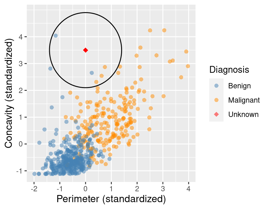
Figure 5.7: Scatter plot of concavity versus perimeter with 5 nearest neighbors circled.
5.5.2 More than two explanatory variables
Although the above description is directed toward two predictor variables, exactly the same K-nearest neighbors algorithm applies when you have a higher number of predictor variables. Each predictor variable may give us new information to help create our classifier. The only difference is the formula for the distance between points. Suppose we have \(m\) predictor variables for two observations \(a\) and \(b\), i.e., \(a = (a_{1}, a_{2}, \dots, a_{m})\) and \(b = (b_{1}, b_{2}, \dots, b_{m})\).
The distance formula becomes
\[\mathrm{Distance} = \sqrt{(a_{1} -b_{1})^2 + (a_{2} - b_{2})^2 + \dots + (a_{m} - b_{m})^2}.\]
This formula still corresponds to a straight-line distance, just in a space with more dimensions. Suppose we want to calculate the distance between a new observation with a perimeter of 0, concavity of 3.5, and symmetry of 1, and another observation with a perimeter, concavity, and symmetry of 0.417, 2.31, and 0.837 respectively. We have two observations with three predictor variables: perimeter, concavity, and symmetry. Previously, when we had two variables, we added up the squared difference between each of our (two) variables, and then took the square root. Now we will do the same, except for our three variables. We calculate the distance as follows
\[\mathrm{Distance} =\sqrt{(0 - 0.417)^2 + (3.5 - 2.31)^2 + (1 - 0.837)^2} = 1.27.\]
Let’s calculate the distances between our new observation and each of the observations in the training set to find the \(K=5\) neighbors when we have these three predictors.
new_obs_Perimeter <- 0
new_obs_Concavity <- 3.5
new_obs_Symmetry <- 1
cancer |>
  select(ID, Perimeter, Concavity, Symmetry, Class) |>
  mutate(dist_from_new = sqrt((Perimeter - new_obs_Perimeter)^2 +
                              (Concavity - new_obs_Concavity)^2 +
                                (Symmetry - new_obs_Symmetry)^2)) |>
  slice_min(dist_from_new, n = 5) # take the 5 rows of minimum distance
## # A tibble: 5 × 6
## ID Perimeter Concavity Symmetry Class dist_from_new
## <dbl> <dbl> <dbl> <dbl> <fct> <dbl>
## 1 907914 0.417 2.31 0.837 Malignant 1.27
## 2 90439701 1.33 2.89 1.10 Malignant 1.47
## 3 925622 0.470 2.08 1.15 Malignant 1.50
## 4 859471 -1.37 2.81 1.09 Benign 1.53
## 5 899667 0.623 2.54 2.06 Malignant 1.56Based on \(K=5\) nearest neighbors with these three predictors, we would classify the new observation as malignant since 4 out of 5 of the nearest neighbors are from the malignant class. Figure 5.8 shows what the data look like when we visualize them as a 3-dimensional scatter with lines from the new observation to its five nearest neighbors.
Figure 5.8: 3D scatter plot of the standardized symmetry, concavity, and perimeter variables. Note that in general we recommend against using 3D visualizations; here we show the data in 3D only to illustrate what higher dimensions and nearest neighbors look like, for learning purposes.
5.5.3 Summary of K-nearest neighbors algorithm
In order to classify a new observation using a K-nearest neighbors classifier, we have to do the following:
- Compute the distance between the new observation and each observation in the training set.
- Sort the data table in ascending order according to the distances.
- Choose the top \(K\) rows of the sorted table.
- Classify the new observation based on a majority vote of the neighbor classes.
5.6 K-nearest neighbors with tidymodels
Coding the K-nearest neighbors algorithm in R ourselves can get complicated,
especially if we want to handle multiple classes, more than two variables,
or predict the class for multiple new observations. Thankfully, in R,
the K-nearest neighbors algorithm is
implemented in the parsnip R package (Kuhn and Vaughan 2021)
included in tidymodels, along with
many other models
that you will encounter in this and future chapters of the book. The tidymodels collection
provides tools to help make and use models, such as classifiers. Using the packages
in this collection will help keep our code simple, readable and accurate; the
less we have to code ourselves, the fewer mistakes we will likely make. We
start by loading tidymodels.
Let’s walk through how to use tidymodels to perform K-nearest neighbors classification.
We will use the cancer data set from above, with
perimeter and concavity as predictors and \(K = 5\) neighbors to build our classifier. Then
we will use the classifier to predict the diagnosis label for a new observation with
perimeter 0, concavity 3.5, and an unknown diagnosis label. Let’s pick out our two desired
predictor variables and class label and store them as a new data set named cancer_train:
## # A tibble: 569 × 3
##    Class     Perimeter Concavity
##    <fct>         <dbl>     <dbl>
##  1 Malignant    1.27      2.65
##  2 Malignant    1.68     -0.0238
##  3 Malignant    1.57      1.36
##  4 Malignant   -0.592     1.91
##  5 Malignant    1.78      1.37
##  6 Malignant   -0.387     0.866
##  7 Malignant    1.14      0.300
##  8 Malignant   -0.0728    0.0610
##  9 Malignant   -0.184     1.22
## 10 Malignant   -0.329     1.74
## # ℹ 559 more rows
Next, we create a model specification for K-nearest neighbors classification
by calling the nearest_neighbor function, specifying that we want to use \(K = 5\) neighbors
(we will discuss how to choose \(K\) in the next chapter) and that each neighboring point should have the same weight when voting
(weight_func = "rectangular"). The weight_func argument controls
how neighbors vote when classifying a new observation; by setting it to "rectangular",
each of the \(K\) nearest neighbors gets exactly 1 vote as described above. Other choices,
which weigh each neighbor’s vote differently, can be found on
the parsnip website.
In the set_engine argument, we specify which package or system will be used for training
the model. Here kknn is the R package we will use for performing K-nearest neighbors classification.
Finally, we specify that this is a classification problem with the set_mode function.
knn_spec <- nearest_neighbor(weight_func = "rectangular", neighbors = 5) |>
  set_engine("kknn") |>
  set_mode("classification")
knn_spec
## K-Nearest Neighbor Model Specification (classification)
##
## Main Arguments:
## neighbors = 5
## weight_func = rectangular
##
## Computational engine: kknnIn order to fit the model on the breast cancer data, we need to pass the model specification
and the data set to the fit function. We also need to specify what variables to use as predictors
and what variable to use as the response. Below, the Class ~ Perimeter + Concavity argument specifies
that Class is the response variable (the one we want to predict),
and both Perimeter and Concavity are to be used as the predictors.
We can also use a convenient shorthand syntax using a period, Class ~ ., to indicate
that we want to use every variable except Class as a predictor in the model.
In this particular setup, since Concavity and Perimeter are the only two predictors in the cancer_train
data frame, Class ~ Perimeter + Concavity and Class ~ . are equivalent.
In general, you can choose individual predictors using the + symbol, or you can specify to
use all predictors using the . symbol.
## parsnip model object
##
##
## Call:
## kknn::train.kknn(formula = Class ~ ., data = data, ks = min_rows(5,     data, 5)
## , kernel = ~"rectangular")
##
## Type of response variable: nominal
## Minimal misclassification: 0.07557118
## Best kernel: rectangular
## Best k: 5
Here you can see the final trained model summary. It confirms that the computational engine used
to train the model was kknn::train.kknn. It also shows the fraction of errors made by
the K-nearest neighbors model, but we will ignore this for now and discuss it in more detail
in the next chapter.
Finally, it shows (somewhat confusingly) that the “best” weight function
was “rectangular” and “best” setting of \(K\) was 5; but since we specified these earlier,
R is just repeating those settings to us here. In the next chapter, we will actually
let R find the value of \(K\) for us.
Finally, we make the prediction on the new observation by calling the predict function,
passing both the fit object we just created and the new observation itself. As above,
when we ran the K-nearest neighbors
classification algorithm manually, the knn_fit object classifies the new observation as
malignant. Note that the predict function outputs a data frame with a single
variable named .pred_class.
## # A tibble: 1 × 1
##   .pred_class
##   <fct>
## 1 Malignant
Is this predicted malignant label the actual class for this observation? Well, we don’t know because we do not have this observation’s diagnosis— that is what we were trying to predict! The classifier’s prediction is not necessarily correct, but in the next chapter, we will learn ways to quantify how accurate we think our predictions are.
5.7 Data preprocessing with tidymodels
5.7.1 Centering and scaling
When using K-nearest neighbors classification, the scale of each variable (i.e., its size and range of values) matters. Since the classifier predicts classes by identifying observations nearest to it, any variables with a large scale will have a much larger effect than variables with a small scale. But just because a variable has a large scale doesn’t mean that it is more important for making accurate predictions. For example, suppose you have a data set with two features, salary (in dollars) and years of education, and you want to predict the corresponding type of job. When we compute the neighbor distances, a difference of $1000 is huge compared to a difference of 10 years of education. But for our conceptual understanding and answering of the problem, it’s the opposite; 10 years of education is huge compared to a difference of $1000 in yearly salary!
In many other predictive models, the center of each variable (e.g., its mean) matters as well. For example, if we had a data set with a temperature variable measured in degrees Kelvin, and the same data set with temperature measured in degrees Celsius, the two variables would differ by a constant shift of 273 (even though they contain exactly the same information). Likewise, in our hypothetical job classification example, we would likely see that the center of the salary variable is in the tens of thousands, while the center of the years of education variable is in the single digits. Although this doesn’t affect the K-nearest neighbors classification algorithm, this large shift can change the outcome of using many other predictive models.
To scale and center our data, we need to find
our variables’ mean (the average, which quantifies the “central” value of a
set of numbers) and standard deviation (a number quantifying how spread out values are).
For each observed value of the variable, we subtract the mean (i.e., center the variable)
and divide by the standard deviation (i.e., scale the variable). When we do this, the data
is said to be standardized, and all variables in a data set will have a mean of 0
and a standard deviation of 1. To illustrate the effect that standardization can have on the K-nearest
neighbors algorithm, we will read in the original, unstandardized Wisconsin breast
cancer data set; we have been using a standardized version of the data set up
until now. As before, we will convert the Class variable to the factor type
and rename the values to “Malignant” and “Benign.”
To keep things simple, we will just use the Area, Smoothness, and Class
variables:
unscaled_cancer <- read_csv("data/wdbc_unscaled.csv") |>
  mutate(Class = as_factor(Class)) |>
  mutate(Class = fct_recode(Class, "Benign" = "B", "Malignant" = "M")) |>
  select(Class, Area, Smoothness)
unscaled_cancer
## # A tibble: 569 × 3
## Class Area Smoothness
## <fct> <dbl> <dbl>
## 1 Malignant 1001 0.118
## 2 Malignant 1326 0.0847
## 3 Malignant 1203 0.110
## 4 Malignant 386. 0.142
## 5 Malignant 1297 0.100
## 6 Malignant 477. 0.128
## 7 Malignant 1040 0.0946
## 8 Malignant 578. 0.119
## 9 Malignant 520. 0.127
## 10 Malignant 476. 0.119
## # ℹ 559 more rowsLooking at the unscaled and uncentered data above, you can see that the differences
between the values for area measurements are much larger than those for
smoothness. Will this affect
predictions? In order to find out, we will create a scatter plot of these two
predictors (colored by diagnosis) for both the unstandardized data we just
loaded, and the standardized version of that same data. But first, we need to
standardize the unscaled_cancer data set with tidymodels.
In the tidymodels framework, all data preprocessing happens
using a recipe from the recipes R package (Kuhn and Wickham 2021).
Here we will initialize a recipe for
the unscaled_cancer data above, specifying
that the Class variable is the response, and all other variables are predictors:
##
## ── Recipe ──────────
##
## ── Inputs
## Number of variables by role
## outcome:   1
## predictor: 2
So far, there is not much in the recipe; just a statement about the number of response variables
and predictors. Let’s add
scaling (step_scale) and
centering (step_center) steps for
all of the predictors so that they each have a mean of 0 and standard deviation of 1.
Note that tidyverse actually provides step_normalize, which does both centering and scaling in
a single recipe step; in this book we will keep step_scale and step_center separate
to emphasize conceptually that there are two steps happening.
The prep function finalizes the recipe by using the data (here, unscaled_cancer)
to compute anything necessary to run the recipe (in this case, the column means and standard
deviations):
uc_recipe <- uc_recipe |>
  step_scale(all_predictors()) |>
  step_center(all_predictors()) |>
  prep()
uc_recipe
##
## ── Recipe ──────────
##
## ── Inputs
## Number of variables by role
## outcome: 1
## predictor: 2
##
## ── Training information
## Training data contained 569 data points and no incomplete rows.
##
## ── Operations
## • Scaling for: Area, Smoothness | Trained
## • Centering for: Area, Smoothness | TrainedYou can now see that the recipe includes a scaling and centering step for all predictor variables.
Note that when you add a step to a recipe, you must specify what columns to apply the step to.
Here we used the all_predictors() function to specify that each step should be applied to
all predictor variables. However, there are a number of different arguments one could use here,
as well as naming particular columns with the same syntax as the select function.
For example:
all_nominal()andall_numeric(): specify all categorical or all numeric variablesall_predictors()andall_outcomes(): specify all predictor or all response variablesArea, Smoothness: specify both theAreaandSmoothnessvariable-Class: specify everything except theClassvariable
You can find a full set of all the steps and variable selection functions
on the recipes reference page.
At this point, we have calculated the required statistics based on the data input into the
recipe, but the data are not yet scaled and centered. To actually scale and center
the data, we need to apply the bake function to the unscaled data.
## # A tibble: 569 × 3
##      Area Smoothness Class
##     <dbl>      <dbl> <fct>
##  1  0.984      1.57  Malignant
##  2  1.91      -0.826 Malignant
##  3  1.56       0.941 Malignant
##  4 -0.764      3.28  Malignant
##  5  1.82       0.280 Malignant
##  6 -0.505      2.24  Malignant
##  7  1.09      -0.123 Malignant
##  8 -0.219      1.60  Malignant
##  9 -0.384      2.20  Malignant
## 10 -0.509      1.58  Malignant
## # ℹ 559 more rows
It may seem redundant that we had to both bake and prep to scale and center the data.
However, we do this in two steps so we can specify a different data set in the bake step if we want.
For example, we may want to specify new data that were not part of the training set.
You may wonder why we are doing so much work just to center and
scale our variables. Can’t we just manually scale and center the Area and
Smoothness variables ourselves before building our K-nearest neighbors model? Well,
technically yes; but doing so is error-prone. In particular, we might
accidentally forget to apply the same centering / scaling when making
predictions, or accidentally apply a different centering / scaling than what
we used while training. Proper use of a recipe helps keep our code simple,
readable, and error-free. Furthermore, note that using prep and bake is
required only when you want to inspect the result of the preprocessing steps
yourself. You will see further on in Section
5.8 that tidymodels provides tools to
automatically apply prep and bake as necessary without additional coding effort.
Figure 5.9 shows the two scatter plots side-by-side—one for unscaled_cancer and one for
scaled_cancer. Each has the same new observation annotated with its \(K=3\) nearest neighbors.
In the original unstandardized data plot, you can see some odd choices
for the three nearest neighbors. In particular, the “neighbors” are visually
well within the cloud of benign observations, and the neighbors are all nearly
vertically aligned with the new observation (which is why it looks like there
is only one black line on this plot). Figure 5.10
shows a close-up of that region on the unstandardized plot. Here the computation of nearest
neighbors is dominated by the much larger-scale area variable. The plot for standardized data
on the right in Figure 5.9 shows a much more intuitively reasonable
selection of nearest neighbors. Thus, standardizing the data can change things
in an important way when we are using predictive algorithms.
Standardizing your data should be a part of the preprocessing you do
before predictive modeling and you should always think carefully about your problem domain and
whether you need to standardize your data.
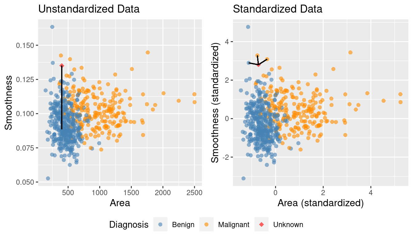
Figure 5.9: Comparison of K = 3 nearest neighbors with unstandardized and standardized data.
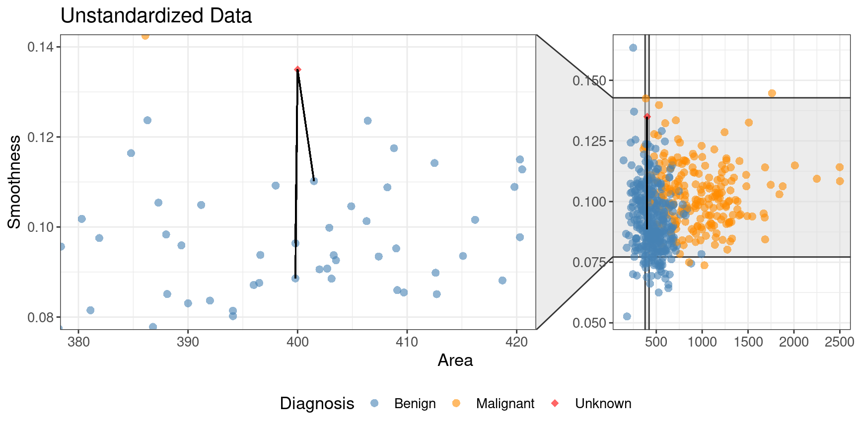
Figure 5.10: Close-up of three nearest neighbors for unstandardized data.
5.7.2 Balancing
Another potential issue in a data set for a classifier is class imbalance, i.e., when one label is much more common than another. Since classifiers like the K-nearest neighbors algorithm use the labels of nearby points to predict the label of a new point, if there are many more data points with one label overall, the algorithm is more likely to pick that label in general (even if the “pattern” of data suggests otherwise). Class imbalance is actually quite a common and important problem: from rare disease diagnosis to malicious email detection, there are many cases in which the “important” class to identify (presence of disease, malicious email) is much rarer than the “unimportant” class (no disease, normal email).
To better illustrate the problem, let’s revisit the scaled breast cancer data,
cancer; except now we will remove many of the observations of malignant tumors, simulating
what the data would look like if the cancer was rare. We will do this by
picking only 3 observations from the malignant group, and keeping all
of the benign observations.
We choose these 3 observations using the slice_head
function, which takes two arguments: a data frame-like object,
and the number of rows to select from the top (n).
We will use the bind_rows function to glue the two resulting filtered
data frames back together, and name the result rare_cancer.
The new imbalanced data is shown in Figure 5.11.
rare_cancer <- bind_rows(
      filter(cancer, Class == "Benign"),
      cancer |> filter(Class == "Malignant") |> slice_head(n = 3)
    ) |>
    select(Class, Perimeter, Concavity)

rare_plot <- rare_cancer |>
  ggplot(aes(x = Perimeter, y = Concavity, color = Class)) +
  geom_point(alpha = 0.5) +
  labs(x = "Perimeter (standardized)",
       y = "Concavity (standardized)",
       color = "Diagnosis") +
  scale_color_manual(values = c("darkorange", "steelblue")) +
  theme(text = element_text(size = 12))

rare_plot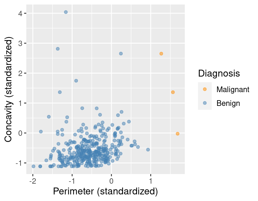
Figure 5.11: Imbalanced data.
Suppose we now decided to use \(K = 7\) in K-nearest neighbors classification. With only 3 observations of malignant tumors, the classifier will always predict that the tumor is benign, no matter what its concavity and perimeter are! This is because in a majority vote of 7 observations, at most 3 will be malignant (we only have 3 total malignant observations), so at least 4 must be benign, and the benign vote will always win. For example, Figure 5.12 shows what happens for a new tumor observation that is quite close to three observations in the training data that were tagged as malignant.
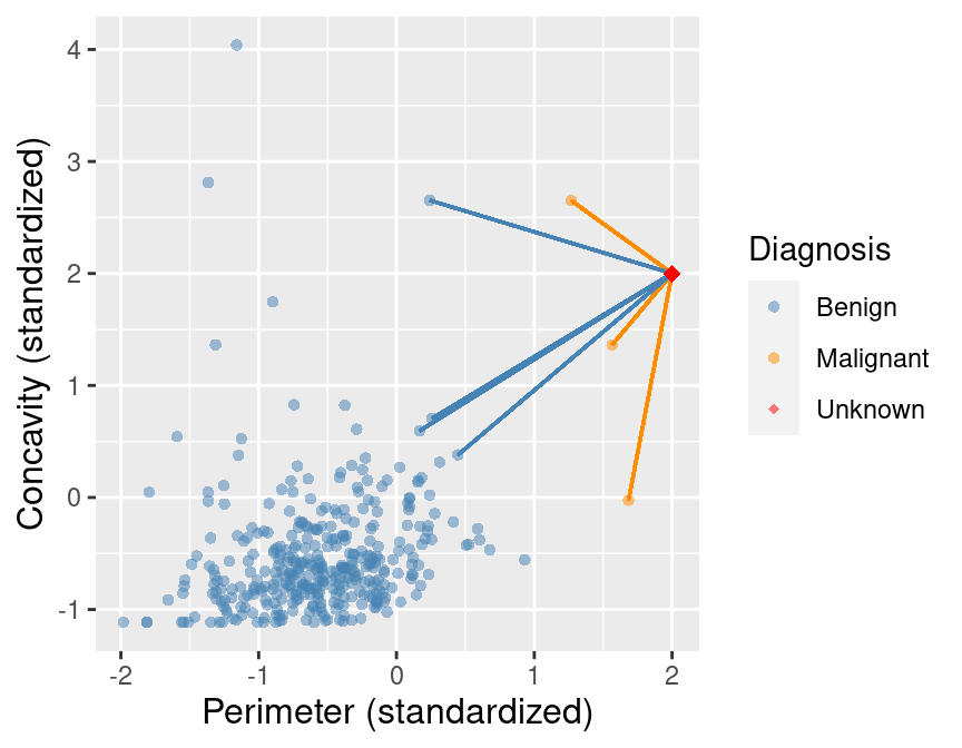
Figure 5.12: Imbalanced data with 7 nearest neighbors to a new observation highlighted.
Figure 5.13 shows what happens if we set the background color of each area of the plot to the prediction the K-nearest neighbors classifier would make for a new observation at that location. We can see that the decision is always “benign,” corresponding to the blue color.
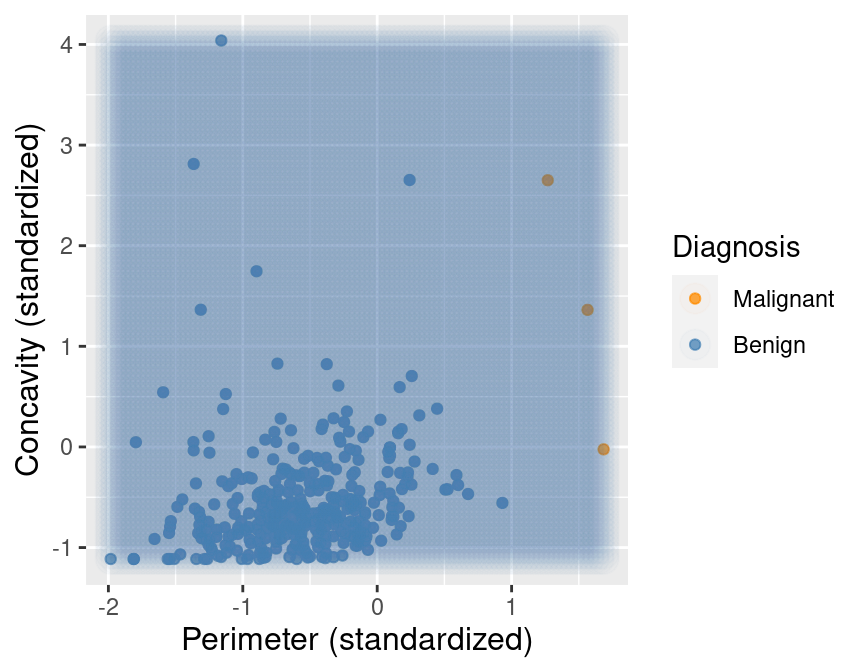
Figure 5.13: Imbalanced data with background color indicating the decision of the classifier and the points represent the labeled data.
Despite the simplicity of the problem, solving it in a statistically sound manner is actually
fairly nuanced, and a careful treatment would require a lot more detail and mathematics than we will cover in this textbook.
For the present purposes, it will suffice to rebalance the data by oversampling the rare class.
In other words, we will replicate rare observations multiple times in our data set to give them more
voting power in the K-nearest neighbors algorithm. In order to do this, we will add an oversampling
step to the earlier uc_recipe recipe with the step_upsample function from the themis R package.
We show below how to do this, and also
use the group_by and summarize functions to see that our classes are now balanced:
library(themis)

ups_recipe <- recipe(Class ~ ., data = rare_cancer) |>
  step_upsample(Class, over_ratio = 1, skip = FALSE) |>
  prep()

ups_recipe
##
## ── Recipe ──────────
##
## ── Inputs
## Number of variables by role
## outcome: 1
## predictor: 2
##
## ── Training information
## Training data contained 360 data points and no incomplete rows.
##
## ── Operations
## • Up-sampling based on: Class | Trainedupsampled_cancer <- bake(ups_recipe, rare_cancer)
upsampled_cancer |>
group_by(Class) |>
summarize(n = n())## # A tibble: 2 × 2
## Class n
## <fct> <int>
## 1 Malignant 357
## 2 Benign 357Now suppose we train our K-nearest neighbors classifier with \(K=7\) on this balanced data. Figure 5.14 shows what happens now when we set the background color of each area of our scatter plot to the decision the K-nearest neighbors classifier would make. We can see that the decision is more reasonable; when the points are close to those labeled malignant, the classifier predicts a malignant tumor, and vice versa when they are closer to the benign tumor observations.
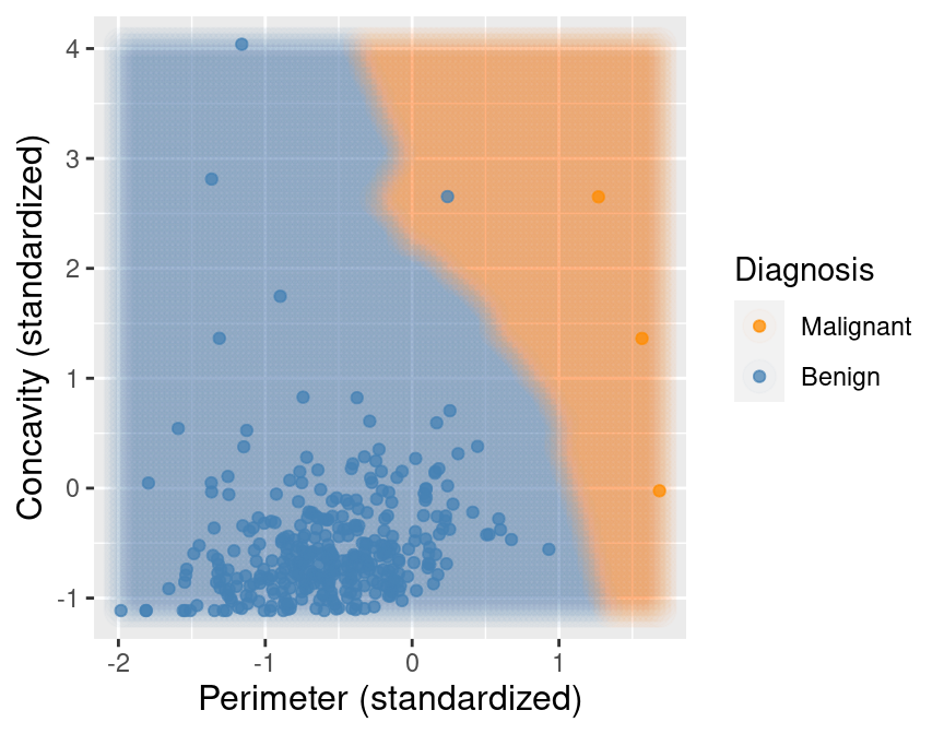
Figure 5.14: Upsampled data with background color indicating the decision of the classifier.
5.7.3 Missing data
One of the most common issues in real data sets in the wild is missing data, i.e., observations where the values of some of the variables were not recorded. Unfortunately, as common as it is, handling missing data properly is very challenging and generally relies on expert knowledge about the data, setting, and how the data were collected. One typical challenge with missing data is that missing entries can be informative: the very fact that an entries were missing is related to the values of other variables. For example, survey participants from a marginalized group of people may be less likely to respond to certain kinds of questions if they fear that answering honestly will come with negative consequences. In that case, if we were to simply throw away data with missing entries, we would bias the conclusions of the survey by inadvertently removing many members of that group of respondents. So ignoring this issue in real problems can easily lead to misleading analyses, with detrimental impacts. In this book, we will cover only those techniques for dealing with missing entries in situations where missing entries are just “randomly missing”, i.e., where the fact that certain entries are missing isn’t related to anything else about the observation.
Let’s load and examine a modified subset of the tumor image data that has a few missing entries:
missing_cancer <- read_csv("data/wdbc_missing.csv") |>
  select(Class, Radius, Texture, Perimeter) |>
  mutate(Class = as_factor(Class)) |>
  mutate(Class = fct_recode(Class, "Malignant" = "M", "Benign" = "B"))
missing_cancer
## # A tibble: 7 × 4
## Class Radius Texture Perimeter
## <fct> <dbl> <dbl> <dbl>
## 1 Malignant NA NA 1.27
## 2 Malignant 1.83 -0.353 1.68
## 3 Malignant 1.58 NA 1.57
## 4 Malignant -0.768 0.254 -0.592
## 5 Malignant 1.75 -1.15 1.78
## 6 Malignant -0.476 -0.835 -0.387
## 7 Malignant 1.17 0.161 1.14Recall that K-nearest neighbors classification makes predictions by computing
the straight-line distance to nearby training observations, and hence requires
access to the values of all variables for all observations in the training
data. So how can we perform K-nearest neighbors classification in the presence
of missing data? Well, since there are not too many observations with missing
entries, one option is to simply remove those observations prior to building
the K-nearest neighbors classifier. We can accomplish this by using the
drop_na function from tidyverse prior to working with the data.
## # A tibble: 5 × 4
##   Class     Radius Texture Perimeter
##   <fct>      <dbl>   <dbl>     <dbl>
## 1 Malignant  1.83   -0.353     1.68
## 2 Malignant -0.768   0.254    -0.592
## 3 Malignant  1.75   -1.15      1.78
## 4 Malignant -0.476  -0.835    -0.387
## 5 Malignant  1.17    0.161     1.14
However, this strategy will not work when many of the rows have missing
entries, as we may end up throwing away too much data. In this case, another
possible approach is to impute the missing entries, i.e., fill in synthetic
values based on the other observations in the data set. One reasonable choice
is to perform mean imputation, where missing entries are filled in using the
mean of the present entries in each variable. To perform mean imputation, we
add the step_impute_mean
step to the tidymodels preprocessing recipe.
impute_missing_recipe <- recipe(Class ~ ., data = missing_cancer) |>
  step_impute_mean(all_predictors()) |>
  prep()
impute_missing_recipe
##
## ── Recipe ──────────
##
## ── Inputs
## Number of variables by role
## outcome: 1
## predictor: 3
##
## ── Training information
## Training data contained 7 data points and 2 incomplete rows.
##
## ── Operations
## • Mean imputation for: Radius, Texture, Perimeter | TrainedTo visualize what mean imputation does, let’s just apply the recipe directly to the missing_cancer
data frame using the bake function. The imputation step fills in the missing
entries with the mean values of their corresponding variables.
## # A tibble: 7 × 4
##   Radius Texture Perimeter Class
##    <dbl>   <dbl>     <dbl> <fct>
## 1  0.847  -0.385     1.27  Malignant
## 2  1.83   -0.353     1.68  Malignant
## 3  1.58   -0.385     1.57  Malignant
## 4 -0.768   0.254    -0.592 Malignant
## 5  1.75   -1.15      1.78  Malignant
## 6 -0.476  -0.835    -0.387 Malignant
## 7  1.17    0.161     1.14  Malignant
Many other options for missing data imputation can be found in
the recipes documentation. However
you decide to handle missing data in your data analysis, it is always crucial
to think critically about the setting, how the data were collected, and the
question you are answering.
5.8 Putting it together in a workflow
The tidymodels package collection also provides the workflow, a way to
chain together
multiple data analysis steps without a lot of otherwise necessary code for
intermediate steps. To illustrate the whole pipeline, let’s start from scratch
with the wdbc_unscaled.csv data. First we will load the data, create a
model, and specify a recipe for how the data should be preprocessed:
# load the unscaled cancer data
# and make sure the response variable, Class, is a factor
unscaled_cancer <- read_csv("data/wdbc_unscaled.csv") |>
  mutate(Class = as_factor(Class)) |>
  mutate(Class = fct_recode(Class, "Malignant" = "M", "Benign" = "B"))

# create the K-NN model
knn_spec <- nearest_neighbor(weight_func = "rectangular", neighbors = 7) |>
  set_engine("kknn") |>
  set_mode("classification")

# create the centering / scaling recipe
uc_recipe <- recipe(Class ~ Area + Smoothness, data = unscaled_cancer) |>
  step_scale(all_predictors()) |>
  step_center(all_predictors())
Note that each of these steps is exactly the same as earlier, except for one major difference:
we did not use the select function to extract the relevant variables from the data frame,
and instead simply specified the relevant variables to use via the
formula Class ~ Area + Smoothness (instead of Class ~ .) in the recipe.
You will also notice that we did not call prep() on the recipe; this is unnecessary when it is
placed in a workflow.
We will now place these steps in a workflow using the add_recipe and add_model functions,
and finally we will use the fit function to run the whole workflow on the unscaled_cancer data.
Note another difference from earlier here: we do not include a formula in the fit function. This
is again because we included the formula in the recipe, so there is no need to respecify it:
knn_fit <- workflow() |>
  add_recipe(uc_recipe) |>
  add_model(knn_spec) |>
  fit(data = unscaled_cancer)

knn_fit
## ══ Workflow [trained] ══════════
## Preprocessor: Recipe
## Model: nearest_neighbor()
##
## ── Preprocessor ──────────
## 2 Recipe Steps
##
## • step_scale()
## • step_center()
##
## ── Model ──────────
##
## Call:
## kknn::train.kknn(formula = ..y ~ ., data = data, ks = min_rows(7, data, 5),
## kernel = ~"rectangular")
##
## Type of response variable: nominal
## Minimal misclassification: 0.112478
## Best kernel: rectangular
## Best k: 7As before, the fit object lists the function that trains the model as well as the “best” settings
for the number of neighbors and weight function (for now, these are just the values we chose
manually when we created knn_spec above). But now the fit object also includes information about
the overall workflow, including the centering and scaling preprocessing steps.
In other words, when we use the predict function with the knn_fit object to make a prediction for a new
observation, it will first apply the same recipe steps to the new observation.
As an example, we will predict the class label of two new observations:
one with Area = 500 and Smoothness = 0.075, and one with Area = 1500 and Smoothness = 0.1.
new_observation <- tibble(Area = c(500, 1500), Smoothness = c(0.075, 0.1))
prediction <- predict(knn_fit, new_observation)

prediction
## # A tibble: 2 × 1
## .pred_class
## <fct>
## 1 Benign
## 2 MalignantThe classifier predicts that the first observation is benign, while the second is
malignant. Figure 5.15 visualizes the predictions that this
trained K-nearest neighbors model will make on a large range of new observations.
Although you have seen colored prediction map visualizations like this a few times now,
we have not included the code to generate them, as it is a little bit complicated.
For the interested reader who wants a learning challenge, we now include it below.
The basic idea is to create a grid of synthetic new observations using the expand.grid function,
predict the label of each, and visualize the predictions with a colored scatter having a very high transparency
(low alpha value) and large point radius. See if you can figure out what each line is doing!
Note: Understanding this code is not required for the remainder of the textbook. It is included for those readers who would like to use similar visualizations in their own data analyses.
# create the grid of area/smoothness vals, and arrange in a data frame
are_grid <- seq(min(unscaled_cancer$Area),
                max(unscaled_cancer$Area),
                length.out = 100)
smo_grid <- seq(min(unscaled_cancer$Smoothness),
                max(unscaled_cancer$Smoothness),
                length.out = 100)
asgrid <- as_tibble(expand.grid(Area = are_grid,
                                Smoothness = smo_grid))

# use the fit workflow to make predictions at the grid points
knnPredGrid <- predict(knn_fit, asgrid)

# bind the predictions as a new column with the grid points
prediction_table <- bind_cols(knnPredGrid, asgrid) |>
  rename(Class = .pred_class)

# plot:
# 1. the colored scatter of the original data
# 2. the faded colored scatter for the grid points
wkflw_plot <-
  ggplot() +
  geom_point(data = unscaled_cancer,
             mapping = aes(x = Area,
                           y = Smoothness,
                           color = Class),
             alpha = 0.75) +
  geom_point(data = prediction_table,
             mapping = aes(x = Area,
                           y = Smoothness,
                           color = Class),
             alpha = 0.02,
             size = 5) +
  labs(color = "Diagnosis",
       x = "Area",
       y = "Smoothness") +
  scale_color_manual(values = c("darkorange", "steelblue")) +
  theme(text = element_text(size = 12))

wkflw_plot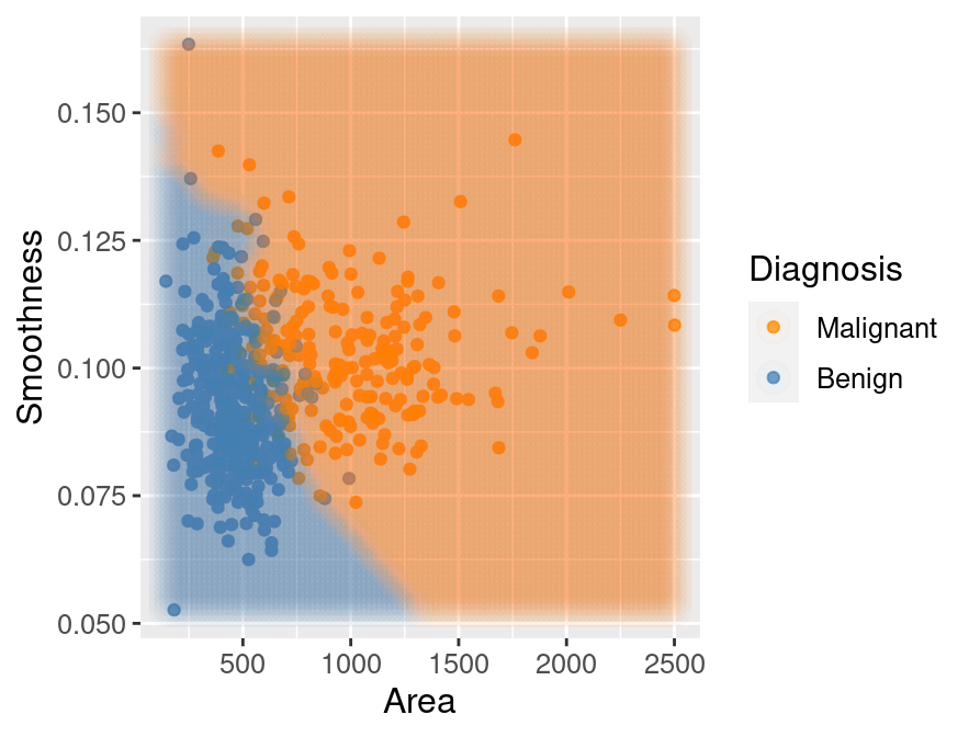
Figure 5.15: Scatter plot of smoothness versus area where background color indicates the decision of the classifier.
5.9 Exercises
Practice exercises for the material covered in this chapter can be found in the accompanying worksheets repository in the “Classification I: training and predicting” row. You can launch an interactive version of the worksheet in your browser by clicking the “launch binder” button. You can also preview a non-interactive version of the worksheet by clicking “view worksheet.” If you instead decide to download the worksheet and run it on your own machine, make sure to follow the instructions for computer setup found in Chapter 13. This will ensure that the automated feedback and guidance that the worksheets provide will function as intended.