 Data Science
Chapter 9 Clustering
9.1 Overview
As part of exploratory data analysis, it is often helpful to see if there are meaningful subgroups (or clusters) in the data. This grouping can be used for many purposes, such as generating new questions or improving predictive analyses. This chapter provides an introduction to clustering using the K-means algorithm, including techniques to choose the number of clusters.
9.2 Chapter learning objectives
By the end of the chapter, readers will be able to do the following:
- Describe a situation in which clustering is an appropriate technique to use, and what insight it might extract from the data.
- Explain the K-means clustering algorithm.
- Interpret the output of a K-means analysis.
- Differentiate between clustering, classification, and regression.
- Identify when it is necessary to scale variables before clustering, and do this using R.
- Perform K-means clustering in R using
tidymodelsworkflows. - Use the elbow method to choose the number of clusters for K-means.
- Visualize the output of K-means clustering in R using colored scatter plots.
- Describe the advantages, limitations and assumptions of the K-means clustering algorithm.
9.3 Clustering
Clustering is a data analysis technique involving separating a data set into subgroups of related data. For example, we might use clustering to separate a data set of documents into groups that correspond to topics, a data set of human genetic information into groups that correspond to ancestral subpopulations, or a data set of online customers into groups that correspond to purchasing behaviors. Once the data are separated, we can, for example, use the subgroups to generate new questions about the data and follow up with a predictive modeling exercise. In this course, clustering will be used only for exploratory analysis, i.e., uncovering patterns in the data.
Note that clustering is a fundamentally different kind of task than classification or regression. In particular, both classification and regression are supervised tasks where there is a response variable (a category label or value), and we have examples of past data with labels/values that help us predict those of future data. By contrast, clustering is an unsupervised task, as we are trying to understand and examine the structure of data without any response variable labels or values to help us. This approach has both advantages and disadvantages. Clustering requires no additional annotation or input on the data. For example, while it would be nearly impossible to annotate all the articles on Wikipedia with human-made topic labels, we can cluster the articles without this information to find groupings corresponding to topics automatically. However, given that there is no response variable, it is not as easy to evaluate the “quality” of a clustering. With classification, we can use a test data set to assess prediction performance. In clustering, there is not a single good choice for evaluation. In this book, we will use visualization to ascertain the quality of a clustering, and leave rigorous evaluation for more advanced courses.
As in the case of classification, there are many possible methods that we could use to cluster our observations to look for subgroups. In this book, we will focus on the widely used K-means algorithm (Lloyd 1982). In your future studies, you might encounter hierarchical clustering, principal component analysis, multidimensional scaling, and more; see the additional resources section at the end of this chapter for where to begin learning more about these other methods.
Note: There are also so-called semisupervised tasks, where only some of the data come with response variable labels/values, but the vast majority don’t. The goal is to try to uncover underlying structure in the data that allows one to guess the missing labels. This sort of task is beneficial, for example, when one has an unlabeled data set that is too large to manually label, but one is willing to provide a few informative example labels as a “seed” to guess the labels for all the data.
9.4 An illustrative example
In this chapter we will focus on a data set from
the palmerpenguins R package (Horst, Hill, and Gorman 2020). This
data set was collected by Dr. Kristen Gorman and
the Palmer Station, Antarctica Long Term Ecological Research Site, and includes
measurements for adult penguins (Figure 9.1) found near there (Gorman, Williams, and Fraser 2014).
Our goal will be to use two
variables—penguin bill and flipper length, both in millimeters—to determine whether
there are distinct types of penguins in our data.
Understanding this might help us with species discovery and classification in a data-driven
way. Note that we have reduced the size of the data set to 18 observations and 2 variables;
this will help us make clear visualizations that illustrate how clustering works for learning purposes.
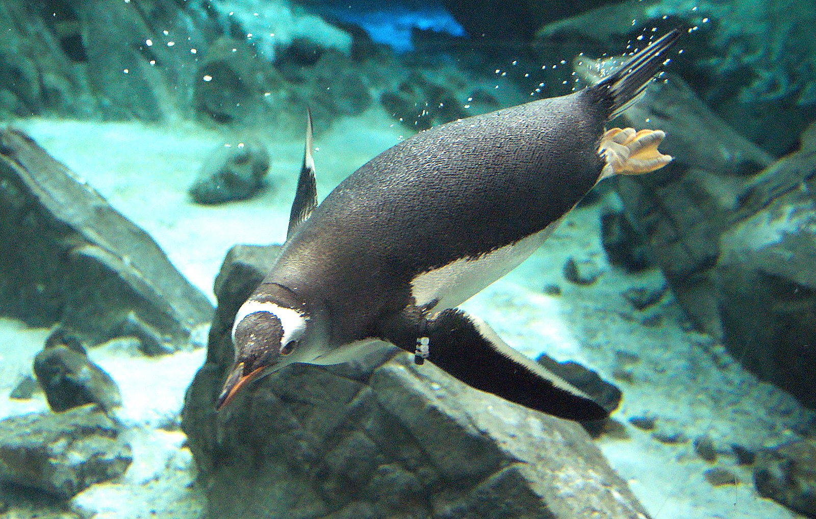
Figure 9.1: A Gentoo penguin.
Before we get started, we will load the tidyverse metapackage
as well as set a random seed.
This will ensure we have access to the functions we need
and that our analysis will be reproducible.
As we will learn in more detail later in the chapter,
setting the seed here is important
because the K-means clustering algorithm uses randomness
when choosing a starting position for each cluster.
Now we can load and preview the penguins data.
## # A tibble: 18 × 2
##    bill_length_mm flipper_length_mm
##             <dbl>             <dbl>
##  1           39.2               196
##  2           36.5               182
##  3           34.5               187
##  4           36.7               187
##  5           38.1               181
##  6           39.2               190
##  7           36                 195
##  8           37.8               193
##  9           46.5               213
## 10           46.1               215
## 11           47.8               215
## 12           45                 220
## 13           49.1               212
## 14           43.3               208
## 15           46                 195
## 16           46.7               195
## 17           52.2               197
## 18           46.8               189
We will begin by using a version of the data that we have standardized, penguins_standardized,
to illustrate how K-means clustering works (recall standardization from Chapter 5).
Later in this chapter, we will return to the original penguins data to see how to include standardization automatically
in the clustering pipeline.
## # A tibble: 18 × 2
##    bill_length_standardized flipper_length_standardized
##                       <dbl>                       <dbl>
##  1                   -0.641                      -0.190
##  2                   -1.14                       -1.33
##  3                   -1.52                       -0.922
##  4                   -1.11                       -0.922
##  5                   -0.847                      -1.41
##  6                   -0.641                      -0.678
##  7                   -1.24                       -0.271
##  8                   -0.902                      -0.434
##  9                    0.720                       1.19
## 10                    0.646                       1.36
## 11                    0.963                       1.36
## 12                    0.440                       1.76
## 13                    1.21                        1.11
## 14                    0.123                       0.786
## 15                    0.627                      -0.271
## 16                    0.757                      -0.271
## 17                    1.78                       -0.108
## 18                    0.776                      -0.759
Next, we can create a scatter plot using this data set to see if we can detect subtypes or groups in our data set.
ggplot(penguins_standardized,
       aes(x = flipper_length_standardized,
           y = bill_length_standardized)) +
  geom_point() +
  xlab("Flipper Length (standardized)") +
  ylab("Bill Length (standardized)") +
  theme(text = element_text(size = 12))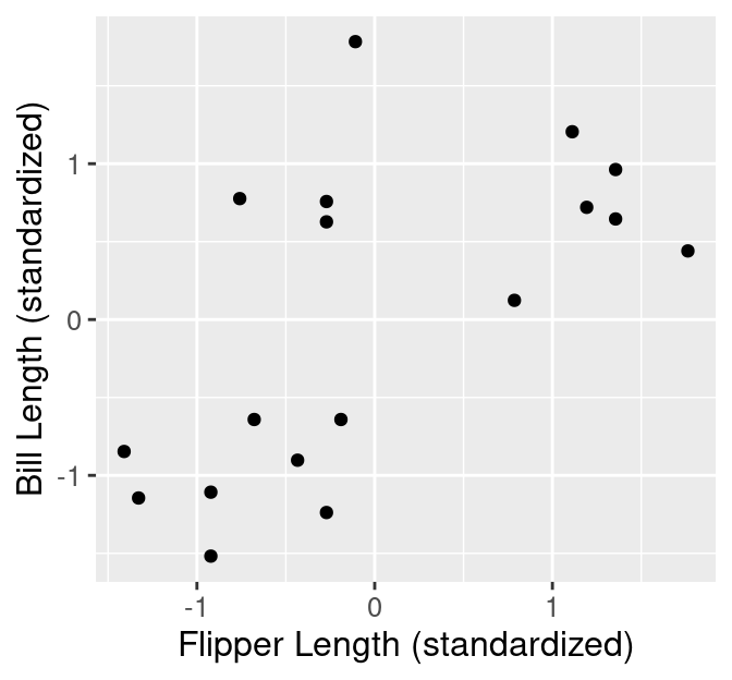
Figure 9.2: Scatter plot of standardized bill length versus standardized flipper length.
Based on the visualization in Figure 9.2, we might suspect there are a few subtypes of penguins within our data set. We can see roughly 3 groups of observations in Figure 9.2, including:
- a small flipper and bill length group,
- a small flipper length, but large bill length group, and
- a large flipper and bill length group.
Data visualization is a great tool to give us a rough sense of such patterns when we have a small number of variables. But if we are to group data—and select the number of groups—as part of a reproducible analysis, we need something a bit more automated. Additionally, finding groups via visualization becomes more difficult as we increase the number of variables we consider when clustering. The way to rigorously separate the data into groups is to use a clustering algorithm. In this chapter, we will focus on the K-means algorithm, a widely used and often very effective clustering method, combined with the elbow method for selecting the number of clusters. This procedure will separate the data into groups; Figure 9.3 shows these groups denoted by colored scatter points.
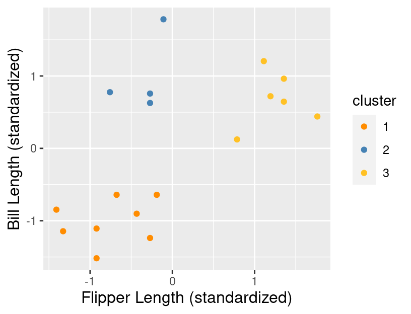
Figure 9.3: Scatter plot of standardized bill length versus standardized flipper length with colored groups.
What are the labels for these groups? Unfortunately, we don’t have any. K-means, like almost all clustering algorithms, just outputs meaningless “cluster labels” that are typically whole numbers: 1, 2, 3, etc. But in a simple case like this, where we can easily visualize the clusters on a scatter plot, we can give human-made labels to the groups using their positions on the plot:
- small flipper length and small bill length (orange cluster),
- small flipper length and large bill length (blue cluster).
- and large flipper length and large bill length (yellow cluster).
Once we have made these determinations, we can use them to inform our species classifications or ask further questions about our data. For example, we might be interested in understanding the relationship between flipper length and bill length, and that relationship may differ depending on the type of penguin we have.
9.5 K-means
9.5.1 Measuring cluster quality
The K-means algorithm is a procedure that groups data into K clusters. It starts with an initial clustering of the data, and then iteratively improves it by making adjustments to the assignment of data to clusters until it cannot improve any further. But how do we measure the “quality” of a clustering, and what does it mean to improve it? In K-means clustering, we measure the quality of a cluster by its within-cluster sum-of-squared-distances (WSSD). Computing this involves two steps. First, we find the cluster centers by computing the mean of each variable over data points in the cluster. For example, suppose we have a cluster containing four observations, and we are using two variables, \(x\) and \(y\), to cluster the data. Then we would compute the coordinates, \(\mu_x\) and \(\mu_y\), of the cluster center via
\[\mu_x = \frac{1}{4}(x_1+x_2+x_3+x_4) \quad \mu_y = \frac{1}{4}(y_1+y_2+y_3+y_4).\]
In the first cluster from the example, there are 4 data points. These are shown with their cluster center (standardized flipper length -0.35, standardized bill length 0.99) highlighted in Figure 9.4.
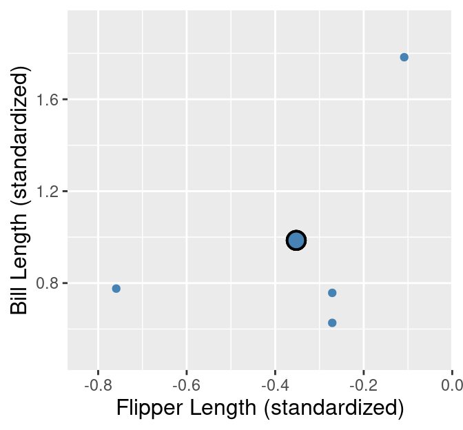
Figure 9.4: Cluster 1 from the penguins_standardized data set example. Observations are small blue points, with the cluster center highlighted as a large blue point with a black outline.
The second step in computing the WSSD is to add up the squared distance between each point in the cluster and the cluster center. We use the straight-line / Euclidean distance formula that we learned about in Chapter 5. In the 4-observation cluster example above, we would compute the WSSD \(S^2\) via
\[\begin{align*} S^2 = \left((x_1 - \mu_x)^2 + (y_1 - \mu_y)^2\right) + \left((x_2 - \mu_x)^2 + (y_2 - \mu_y)^2\right) + \\ \left((x_3 - \mu_x)^2 + (y_3 - \mu_y)^2\right) + \left((x_4 - \mu_x)^2 + (y_4 - \mu_y)^2\right). \end{align*}\]
These distances are denoted by lines in Figure 9.5 for the first cluster of the penguin data example.
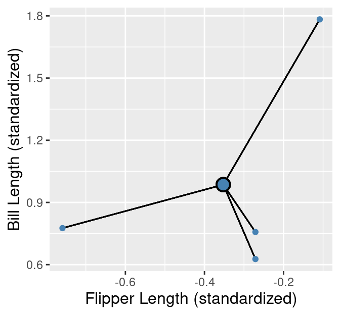
Figure 9.5: Cluster 1 from the penguins_standardized data set example. Observations are small blue points, with the cluster center highlighted as a large blue point with a black outline. The distances from the observations to the cluster center are represented as black lines.
The larger the value of \(S^2\), the more spread out the cluster is, since large \(S^2\) means that points are far from the cluster center. Note, however, that “large” is relative to both the scale of the variables for clustering and the number of points in the cluster. A cluster where points are very close to the center might still have a large \(S^2\) if there are many data points in the cluster.
After we have calculated the WSSD for all the clusters, we sum them together to get the total WSSD. For our example, this means adding up all the squared distances for the 18 observations. These distances are denoted by black lines in Figure 9.6.
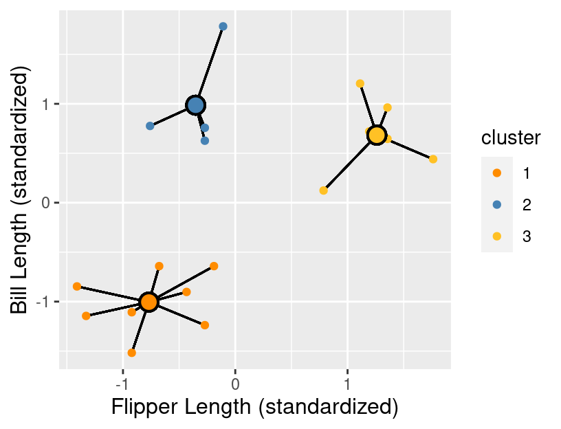
Figure 9.6: All clusters from the penguins_standardized data set example. Observations are small orange, blue, and yellow points with cluster centers denoted by larger points with a black outline. The distances from the observations to each of the respective cluster centers are represented as black lines.
Since K-means uses the straight-line distance to measure the quality of a clustering, it is limited to clustering based on quantitative variables. However, note that there are variants of the K-means algorithm, as well as other clustering algorithms entirely, that use other distance metrics to allow for non-quantitative data to be clustered. These are beyond the scope of this book.
9.5.2 The clustering algorithm
We begin the K-means algorithm by picking K, and randomly assigning a roughly equal number of observations to each of the K clusters. An example random initialization is shown in Figure 9.7.
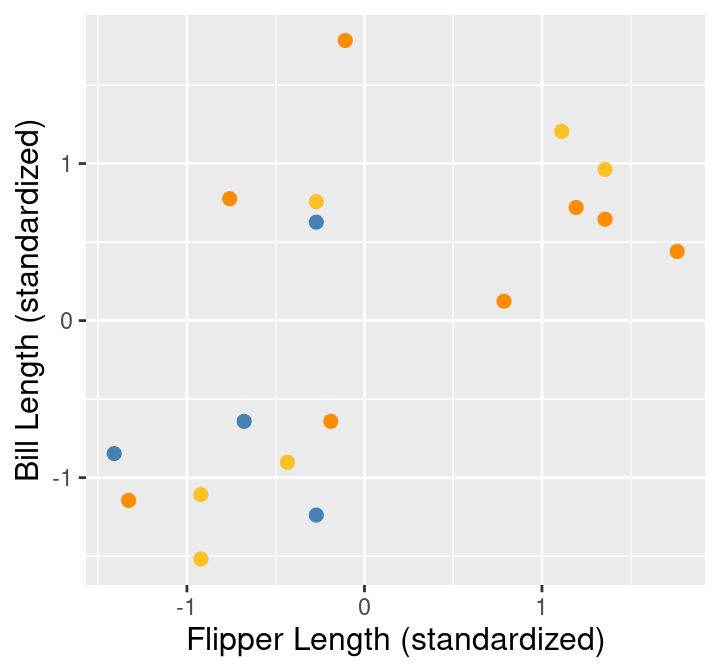
Figure 9.7: Random initialization of labels.
Then K-means consists of two major steps that attempt to minimize the sum of WSSDs over all the clusters, i.e., the total WSSD:
- Center update: Compute the center of each cluster.
- Label update: Reassign each data point to the cluster with the nearest center.
These two steps are repeated until the cluster assignments no longer change. We show what the first four iterations of K-means would look like in Figure 9.8. There each pair of plots in each row corresponds to an iteration, where the left figure in the pair depicts the center update, and the right figure in the pair depicts the label update (i.e., the reassignment of data to clusters).
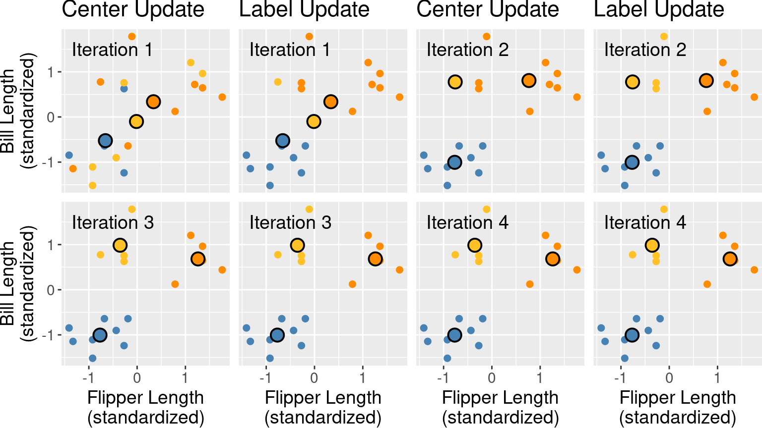
Figure 9.8: First four iterations of K-means clustering on the penguins_standardized example data set. Each pair of plots corresponds to an iteration. Within the pair, the first plot depicts the center update, and the second plot depicts the reassignment of data to clusters. Cluster centers are indicated by larger points that are outlined in black.
Note that at this point, we can terminate the algorithm since none of the assignments changed in the fourth iteration; both the centers and labels will remain the same from this point onward.
Note: Is K-means guaranteed to stop at some point, or could it iterate forever? As it turns out, thankfully, the answer is that K-means is guaranteed to stop after some number of iterations. For the interested reader, the logic for this has three steps: (1) both the label update and the center update decrease total WSSD in each iteration, (2) the total WSSD is always greater than or equal to 0, and (3) there are only a finite number of possible ways to assign the data to clusters. So at some point, the total WSSD must stop decreasing, which means none of the assignments are changing, and the algorithm terminates.
9.5.3 Random restarts
Unlike the classification and regression models we studied in previous chapters, K-means can get “stuck” in a bad solution. For example, Figure 9.9 illustrates an unlucky random initialization by K-means.
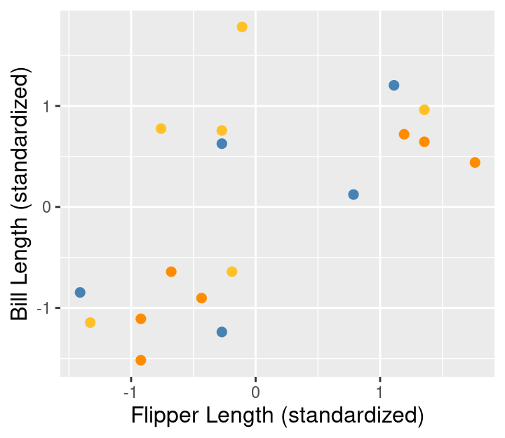
Figure 9.9: Random initialization of labels.
Figure 9.10 shows what the iterations of K-means would look like with the unlucky random initialization shown in Figure 9.9.
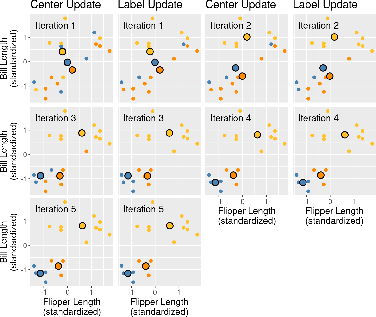
Figure 9.10: First five iterations of K-means clustering on the penguins_standardized example data set with a poor random initialization. Each pair of plots corresponds to an iteration. Within the pair, the first plot depicts the center update, and the second plot depicts the reassignment of data to clusters. Cluster centers are indicated by larger points that are outlined in black.
This looks like a relatively bad clustering of the data, but K-means cannot improve it. To solve this problem when clustering data using K-means, we should randomly re-initialize the labels a few times, run K-means for each initialization, and pick the clustering that has the lowest final total WSSD.
9.5.4 Choosing K
In order to cluster data using K-means, we also have to pick the number of clusters, K. But unlike in classification, we have no response variable and cannot perform cross-validation with some measure of model prediction error. Further, if K is chosen too small, then multiple clusters get grouped together; if K is too large, then clusters get subdivided. In both cases, we will potentially miss interesting structure in the data. Figure 9.11 illustrates the impact of K on K-means clustering of our penguin flipper and bill length data by showing the different clusterings for K’s ranging from 1 to 9.
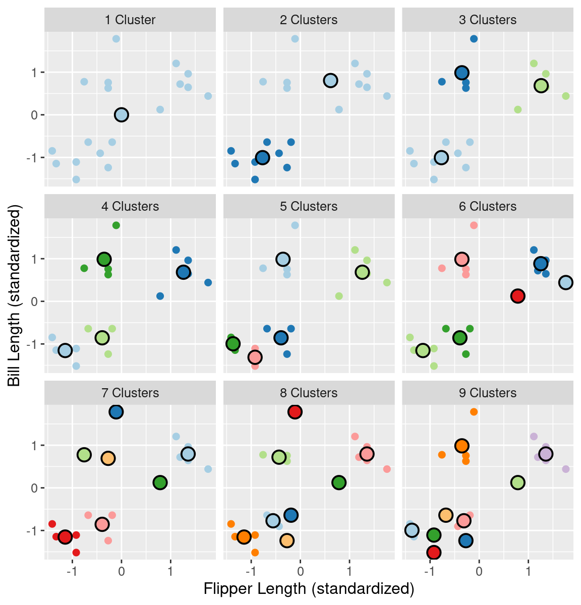
Figure 9.11: Clustering of the penguin data for K clusters ranging from 1 to 9. Cluster centers are indicated by larger points that are outlined in black.
If we set K less than 3, then the clustering merges separate groups of data; this causes a large total WSSD, since the cluster center is not close to any of the data in the cluster. On the other hand, if we set K greater than 3, the clustering subdivides subgroups of data; this does indeed still decrease the total WSSD, but by only a diminishing amount. If we plot the total WSSD versus the number of clusters, we see that the decrease in total WSSD levels off (or forms an “elbow shape”) when we reach roughly the right number of clusters (Figure 9.12).
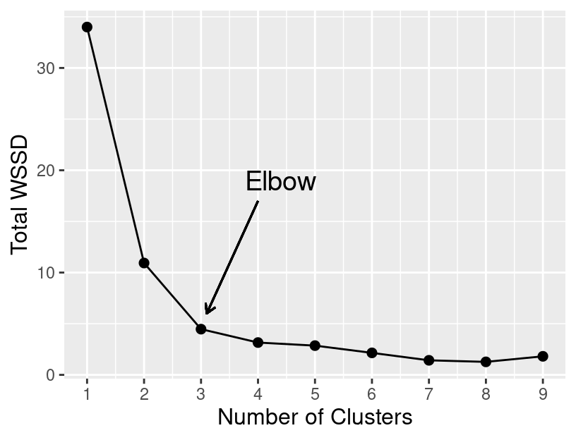
Figure 9.12: Total WSSD for K clusters ranging from 1 to 9.
9.6 K-means in R
We can perform K-means clustering in R using a tidymodels workflow similar
to those in the earlier classification and regression chapters.
We will begin by loading the tidyclust library, which contains the necessary
functionality.
Returning to the original (unstandardized) penguins data,
recall that K-means clustering uses straight-line
distance to decide which points are similar to
each other. Therefore, the scale of each of the variables in the data
will influence which cluster data points end up being assigned.
Variables with a large scale will have a much larger
effect on deciding cluster assignment than variables with a small scale.
To address this problem, we need to create a recipe that
standardizes our data
before clustering using the step_scale and step_center preprocessing steps.
Standardization will ensure that each variable has a mean
of 0 and standard deviation of 1 prior to clustering.
We will designate that all variables are to be used in clustering via
the model formula ~ ..
Note: Recipes were originally designed specifically for predictive data analysis problems—like classification and regression—not clustering problems. So the functions in R that we use to construct recipes are a little bit awkward in the setting of clustering In particular, we will have to treat “predictors” here as if it meant “variables to be used in clustering”. So the model formula
~ .specifies that all variables are “predictors”, i.e., all variables should be used for clustering. Similarly, when we use theall_predictors()function in the preprocessing steps, we really mean “apply this step to all variables used for clustering.”
kmeans_recipe <- recipe(~ ., data=penguins) |>
    step_scale(all_predictors()) |>
    step_center(all_predictors())
kmeans_recipe
##
## ── Recipe ──────────
##
## ── Inputs
## Number of variables by role
## predictor: 2
##
## ── Operations
## • Scaling for: all_predictors()
## • Centering for: all_predictors()To indicate that we are performing K-means clustering, we will use the k_means
model specification. We will use the num_clusters argument to specify the number
of clusters (here we choose K = 3), and specify that we are using the "stats" engine.
## K Means Cluster Specification (partition)
##
## Main Arguments:
##   num_clusters = 3
##
## Computational engine: stats
To actually run the K-means clustering, we combine the recipe and model
specification in a workflow, and use the fit function. Note that the
K-means algorithm uses a random initialization of assignments; but since
we set the random seed earlier, the clustering will be reproducible.
kmeans_fit <- workflow() |>
    add_recipe(kmeans_recipe) |>
    add_model(kmeans_spec) |>
    fit(data = penguins)

kmeans_fit
## ══ Workflow [trained] ══════════
## Preprocessor: Recipe
## Model: k_means()
##
## ── Preprocessor ──────────
## 2 Recipe Steps
##
## • step_scale()
## • step_center()
##
## ── Model ──────────
## K-means clustering with 3 clusters of sizes 4, 6, 8
##
## Cluster means:
## bill_length_mm flipper_length_mm
## 1 0.9858721 -0.3524358
## 2 0.6828058 1.2606357
## 3 -1.0050404 -0.7692589
##
## Clustering vector:
## [1] 3 3 3 3 3 3 3 3 2 2 2 2 2 2 1 1 1 1
##
## Within cluster sum of squares by cluster:
## [1] 1.098928 1.247042 2.121932
## (between_SS / total_SS = 86.9 %)
##
## Available components:
##
## [1] "cluster" "centers" "totss" "withinss" "tot.withinss"
## [6] "betweenss" "size" "iter" "ifault"As you can see above, the fit object has a lot of information
that can be used to visualize the clusters, pick K, and evaluate the total WSSD.
Let’s start by visualizing the clusters as a colored scatter plot! In
order to do that, we first need to augment our
original data frame with the cluster assignments. We can
achieve this using the augment function from tidyclust.
## # A tibble: 18 × 3
##    bill_length_mm flipper_length_mm .pred_cluster
##             <dbl>             <dbl> <fct>
##  1           39.2               196 Cluster_1
##  2           36.5               182 Cluster_1
##  3           34.5               187 Cluster_1
##  4           36.7               187 Cluster_1
##  5           38.1               181 Cluster_1
##  6           39.2               190 Cluster_1
##  7           36                 195 Cluster_1
##  8           37.8               193 Cluster_1
##  9           46.5               213 Cluster_2
## 10           46.1               215 Cluster_2
## 11           47.8               215 Cluster_2
## 12           45                 220 Cluster_2
## 13           49.1               212 Cluster_2
## 14           43.3               208 Cluster_2
## 15           46                 195 Cluster_3
## 16           46.7               195 Cluster_3
## 17           52.2               197 Cluster_3
## 18           46.8               189 Cluster_3
Now that we have the cluster assignments included in the clustered_data tidy data frame, we can
visualize them as shown in Figure 9.13.
Note that we are plotting the un-standardized data here; if we for some reason wanted to
visualize the standardized data from the recipe, we would need to use the bake function
to obtain that first.
cluster_plot <- ggplot(clustered_data,
  aes(x = flipper_length_mm,
      y = bill_length_mm,
      color = .pred_cluster),
  size = 2) +
  geom_point() +
  labs(x = "Flipper Length",
       y = "Bill Length",
       color = "Cluster") +
  scale_color_manual(values = c("steelblue",
                                "darkorange",
                                "goldenrod1")) +
  theme(text = element_text(size = 12))

cluster_plot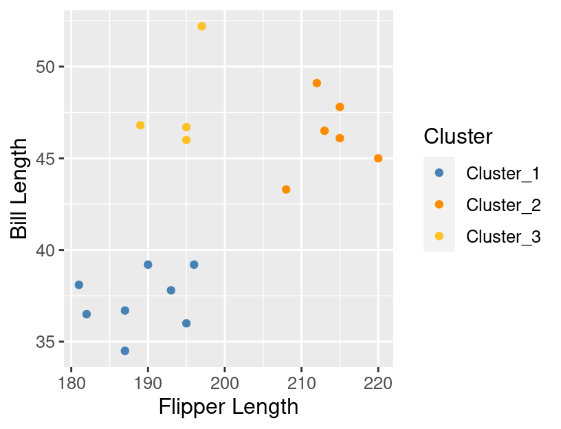
Figure 9.13: The data colored by the cluster assignments returned by K-means.
As mentioned above, we also need to select K by finding
where the “elbow” occurs in the plot of total WSSD versus the number of clusters.
We can obtain the total WSSD (tot.withinss) from our
clustering with 3 clusters using the glance function.
## # A tibble: 1 × 4
##   totss tot.withinss betweenss  iter
##   <dbl>        <dbl>     <dbl> <int>
## 1    34         4.47      29.5     2
To calculate the total WSSD for a variety of Ks, we will
create a data frame with a column named num_clusters with rows containing
each value of K we want to run K-means with (here, 1 to 9).
## # A tibble: 9 × 1
##   num_clusters
##          <int>
## 1            1
## 2            2
## 3            3
## 4            4
## 5            5
## 6            6
## 7            7
## 8            8
## 9            9
Then we construct our model specification again, this time
specifying that we want to tune the num_clusters parameter.
## K Means Cluster Specification (partition)
##
## Main Arguments:
##   num_clusters = tune()
##
## Computational engine: stats
We combine the recipe and specification in a workflow, and then
use the tune_cluster function to run K-means on each of the different
settings of num_clusters. The grid argument controls which values of
K we want to try—in this case, the values from 1 to 9 that are
stored in the penguin_clust_ks data frame. We set the resamples
argument to apparent(penguins) to tell K-means to run on the whole
data set for each value of num_clusters. Finally, we collect the results
using the collect_metrics function.
kmeans_results <- workflow() |>
    add_recipe(kmeans_recipe) |>
    add_model(kmeans_spec) |>
    tune_cluster(resamples = apparent(penguins), grid = penguin_clust_ks) |>
    collect_metrics()
kmeans_results
## # A tibble: 18 × 7
## num_clusters .metric .estimator mean n std_err .config
## <int> <chr> <chr> <dbl> <int> <dbl> <chr>
## 1 1 sse_total standard 34 1 NA Preprocessor1_…
## 2 1 sse_within_total standard 34 1 NA Preprocessor1_…
## 3 2 sse_total standard 34 1 NA Preprocessor1_…
## 4 2 sse_within_total standard 10.9 1 NA Preprocessor1_…
## 5 3 sse_total standard 34 1 NA Preprocessor1_…
## 6 3 sse_within_total standard 4.47 1 NA Preprocessor1_…
## 7 4 sse_total standard 34 1 NA Preprocessor1_…
## 8 4 sse_within_total standard 3.54 1 NA Preprocessor1_…
## 9 5 sse_total standard 34 1 NA Preprocessor1_…
## 10 5 sse_within_total standard 2.23 1 NA Preprocessor1_…
## 11 6 sse_total standard 34 1 NA Preprocessor1_…
## 12 6 sse_within_total standard 1.75 1 NA Preprocessor1_…
## 13 7 sse_total standard 34 1 NA Preprocessor1_…
## 14 7 sse_within_total standard 2.06 1 NA Preprocessor1_…
## 15 8 sse_total standard 34 1 NA Preprocessor1_…
## 16 8 sse_within_total standard 2.46 1 NA Preprocessor1_…
## 17 9 sse_total standard 34 1 NA Preprocessor1_…
## 18 9 sse_within_total standard 0.906 1 NA Preprocessor1_…The total WSSD results correspond to the mean column when the .metric variable is equal to sse_within_total.
We can obtain a tidy data frame with this information using filter and mutate.
kmeans_results <- kmeans_results |>
    filter(.metric == "sse_within_total") |>
    mutate(total_WSSD = mean) |>
    select(num_clusters, total_WSSD)
kmeans_results
## # A tibble: 9 × 2
## num_clusters total_WSSD
## <int> <dbl>
## 1 1 34
## 2 2 10.9
## 3 3 4.47
## 4 4 3.54
## 5 5 2.23
## 6 6 1.75
## 7 7 2.06
## 8 8 2.46
## 9 9 0.906Now that we have total_WSSD and num_clusters as columns in a data frame, we can make a line plot
(Figure 9.14) and search for the “elbow” to find which value of K to use.
elbow_plot <- ggplot(kmeans_results, aes(x = num_clusters, y = total_WSSD)) +
  geom_point() +
  geom_line() +
  xlab("K") +
  ylab("Total within-cluster sum of squares") +
  scale_x_continuous(breaks = 1:9) +
  theme(text = element_text(size = 12))

elbow_plot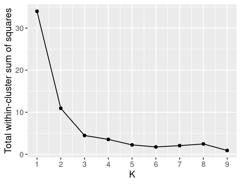
Figure 9.14: A plot showing the total WSSD versus the number of clusters.
It looks like 3 clusters is the right choice for this data.
But why is there a “bump” in the total WSSD plot here?
Shouldn’t total WSSD always decrease as we add more clusters?
Technically yes, but remember: K-means can get “stuck” in a bad solution.
Unfortunately, for K = 8 we had an unlucky initialization
and found a bad clustering!
We can help prevent finding a bad clustering
by trying a few different random initializations
via the nstart argument in the model specification.
Here we will try using 10 restarts.
## K Means Cluster Specification (partition)
##
## Main Arguments:
##   num_clusters = tune()
##
## Engine-Specific Arguments:
##   nstart = 10
##
## Computational engine: stats
Now if we rerun the same workflow with the new model specification,
K-means clustering will be performed nstart = 10 times for each value of K.
The collect_metrics function will then pick the best clustering of the 10 runs for each value of K,
and report the results for that best clustering.
Figure 9.15 shows the resulting
total WSSD plot from using 10 restarts; the bump is gone and the total WSSD decreases as expected.
The more times we perform K-means clustering,
the more likely we are to find a good clustering (if one exists).
What value should you choose for nstart? The answer is that it depends
on many factors: the size and characteristics of your data set,
as well as how powerful your computer is.
The larger the nstart value the better from an analysis perspective,
but there is a trade-off that doing many clusterings
could take a long time.
So this is something that needs to be balanced.
kmeans_results <- workflow() |>
    add_recipe(kmeans_recipe) |>
    add_model(kmeans_spec) |>
    tune_cluster(resamples = apparent(penguins), grid = penguin_clust_ks) |>
    collect_metrics() |>
    filter(.metric == "sse_within_total") |>
    mutate(total_WSSD = mean) |>
    select(num_clusters, total_WSSD)

elbow_plot <- ggplot(kmeans_results, aes(x = num_clusters, y = total_WSSD)) +
  geom_point() +
  geom_line() +
  xlab("K") +
  ylab("Total within-cluster sum of squares") +
  scale_x_continuous(breaks = 1:9) +
  theme(text = element_text(size = 12))

elbow_plot
Figure 9.15: A plot showing the total WSSD versus the number of clusters when K-means is run with 10 restarts.
9.7 Exercises
Practice exercises for the material covered in this chapter can be found in the accompanying worksheets repository in the “Clustering” row. You can launch an interactive version of the worksheet in your browser by clicking the “launch binder” button. You can also preview a non-interactive version of the worksheet by clicking “view worksheet.” If you instead decide to download the worksheet and run it on your own machine, make sure to follow the instructions for computer setup found in Chapter 13. This will ensure that the automated feedback and guidance that the worksheets provide will function as intended.
9.8 Additional resources
- Chapter 10 of An Introduction to Statistical Learning (James et al. 2013) provides a great next stop in the process of learning about clustering and unsupervised learning in general. In the realm of clustering specifically, it provides a great companion introduction to K-means, but also covers hierarchical clustering for when you expect there to be subgroups, and then subgroups within subgroups, etc., in your data. In the realm of more general unsupervised learning, it covers principal components analysis (PCA), which is a very popular technique for reducing the number of predictors in a data set.